Think your page of the website deserves a spot in the main menu? Think again.
The UX, or “user experience” describes how it feels for a person who lands on your website to “use” it, find what they need, etc. It is arguably one of the most critical pieces in determining the success of your website.
We’re here to talk specifically about one part of UX: navigation. Any website with effective navigation is built based on an information architecture that “focuses on organizing, structuring and labeling content in an effective and sustainable way.” Ultimately, the goal is to help users find what they need in a way that makes the UX feel invisible – which we’ll discuss later. To understand the recipe for great navigation, let’s first dive into what some colleges are doing wrong.
Within every institution, there are numerous departments – each of them working extremely hard to create and maintain courses, activities, resources and more to help engage their students. So why shouldn’t everyone deserve a spot in the main menu of the website?
Overcrowding
Would you put 100 words on a billboard off the highway? Probably not, because people won’t have time to read it. Think of your website the same way: users will leave a web page if they can’t find what they need in 10-20 seconds. A clear navigation structure or value proposition is paramount to moving them further into the site. A general rule of thumb is to have seven or fewer links in your main menu.
Not enough focus on the student
While the college website should include information about all of your institution’s programs, services, and everything else it has to offer, these items have a proper place. A clean and simple navigation prioritizes the student’s needs, while also helping that student intuitively find that information that might need to live deeper on your site. Think of it as keeping a clean and organized space in your home or office, where you can easily find what you need, when you need it. Your college’s website is its most important marketing tool, and needs to act as such. When you fail to identify the main goals of your users, you are interrupting the enrollment funnel before they’ve even had a chance to apply.
While we’ve seen our fair share of poorly designed college websites, we’ve also seen some phenomenal ones with an exceptional navigation structure and overall user experience. You can probably guess that what makes them good is cutting out the nonsense – but we’ll explain.
Simplicity
As mentioned above, giving students too many options can cause them to feel overwhelmed, thus resulting in them leaving your website. To lower bounce and exit rates, try to keep the primary menu as concise as possible (this may mean moving some items to a secondary menu, but should be done so based on user research).

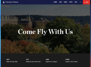
University of Dayton in Dayton, Ohio has a simple, concise primary menu, supplemented by a full-page main menu and a secondary menu towards the page fold. Everything a new student would need can be accessed with a single click.
Built with students top-of-mind
Behind every successful college website is a group of department heads, board members, faculty and other stakeholders that were all willing to step back and ask, “is this what our students need”? A great example of this is, BridgeValley Community and Technical College, who came to us with a main menu so extensive that it had spilled over onto a second line. They knew it needed to change, and our web team was able to make their site much more user-friendly, while still having places throughout the site that highlighted their departments.

BridgeValley Community and Technical College’s old website with a primary navigation consisting of ten pages.

25th Hour redesigned BridgeValley Community and Technical College’s website with an information architecture that prioritized new students. The main menu was reduced from ten pages to six.
Makes the UX feel invisible
We mentioned earlier that the ultimate goal of your website and its information architecture should be to help users find what they need in a way that makes the user experience feel invisible. So what exactly does that mean? Well, while the user interface is everything you can see (from button styles to student imagery) and can be critiqued subjectively, the user experience is so much more than just the menu. It consists of responsiveness, error handling, user-friendly forms, and everything else that you don’t think about until it doesn’t work right. These are objective properties of your website that either work or don’t, and great websites make sure these are constantly executed seamlessly, making them feel invisible.
A lot of clients come to us with a concern that changing their entire website structure is going to confuse their students, so if this sounds like you – don’t worry, you’re not alone. An adjustment period to a new navigation is likely, unfortunately. But when backed by user research, a new menu can do wonders for your enrollment and retention strategies.
There’s no right or wrong time to go through a website overhaul, and technically, your website should never be “done.” The worst thing you can do is create an information architecture that doesn’t leave room for new content because it will instantly give your site an expiration date. We recommend continuously user testing and reviewing analytics to see what is and isn’t working, then iterate.
A clean, user-friendly website is critical. Your website is literally your college’s first impression, and if it isn’t navigable, it won’t be a good one. Much like walking onto a college campus for the first time, if there isn’t good navigational signage, students will easily get lost, frustrated, or worse - leave. Finding out what your website users are looking for and providing them with those options upfront will pay dividends.
Our team is always happy to answer any questions you may have about best practices for your website. Reach out to us at [email protected]!